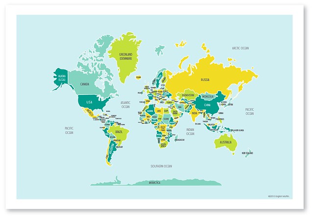
I've got the whole world in my hands. Well almost. Before I head off to print the long awaited World Maps, I'd love to hear your feedback. Here's my concern: with so many countries in the world, do you think the map ends up looking a little text heavy? I've tried to keep the font size similar to the other maps for consistency but obviously needed to scale it down a bit in some areas. I'd love to hear your thoughts...
ps. the colour also looks a little washed out now that I've uploaded this file to the blog, but in real life it will be nice and vibrant!
Have a wonderful weekend!
xo bess
xo bess

Love it! People need to know what countries they are looking at... otherwise what is the point of a map?! :)
ReplyDeleteI don't find it too tight. I expect to see a bunch of countries close together like that. If you feel you might want more space, you might consider putting little lines that connect to the country name a bit further away, but I don't actually think that's necessary :) Must have been so much work! Love it Bess!! xo
ReplyDeleteI love it and can't wait to order it... how long before that is possible?
ReplyDeleteHi Sheryl, you'll be able to order them next week. I'll be sure to post it on the blog when they're available. Thanks!
ReplyDelete